
GRAPHIC DESIGN
Book Cover Redesign: DOROTHY MUST DIE SERIES


The intent was to recreate book covers of books we had read. The first image shows my recreations of the cover art, and the second image is what the original cover art was for the story. Things that I chose to do in my recreation were to increase image intensity, use unique photography, lean in to the story's darker personality, and improve on the font.
Magazine Advertisements: White Claw Hard Seltzer

This is a series of advertisements for a class that features White Claw Hard Seltzer. Some of the advertisements' objectives were to manipulate fruit photography to create a focal point, create cohesion between the set, and use an image of the product..
Awareness Posters: Drug abuse within the LGBTQ+

This is a series that is intended for getting people's attention. I created two posters taking on drug abuse within club culture. I wanted the signs to be so odd that it makes the viewer look twice at it.
Postal Stamp Series: The Life of an Egg

This is a story series of stamps. I needed to create five stamps that feature some topic dealing with breakfast. I was also challenged by only being allowed to use two different colors and making sure that the set had a visual flow that when into the proceeding stamp. I chose the topic of eggs, and I wanted to tell the story of making an omelet.
TR-UCE Whiskey Bottle Label

A family friend reached out to me to create a label for a novelty whiskey he was making. He wanted me to use the “Peace and Friendship” coin and to use inspiration from the 1800s.
*COMMISSIONED
Men’s Swimming Fundraising Calendar


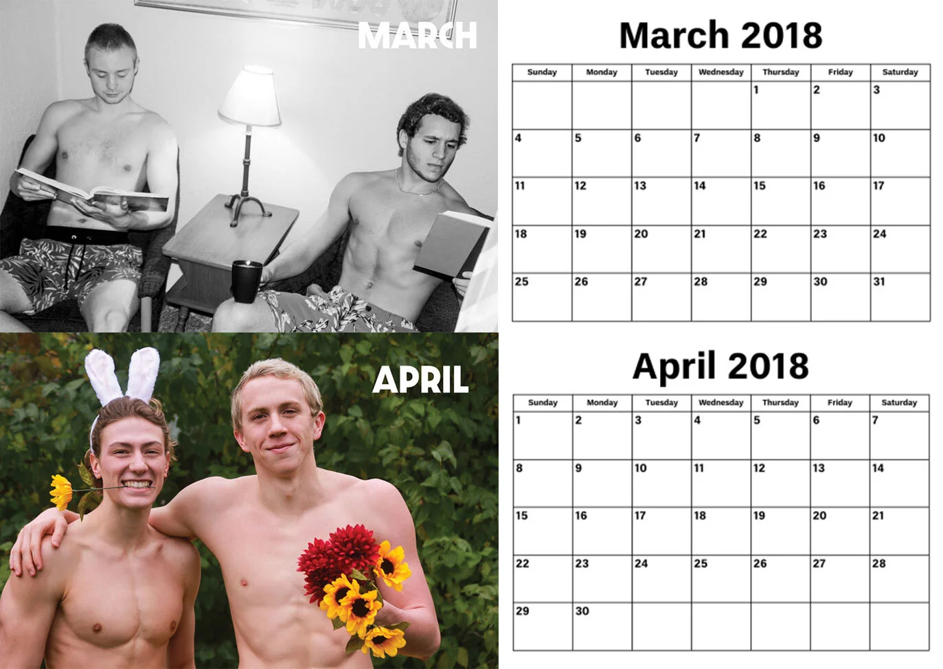


During the 2017-2018 season, a fellow teammate approached me with an additional fundraising effort for the men’s team. We created a calendar to compete with the fraternity Lambda Chi. I was tasked with photography, photo editing, and selling the calendar to sororities and female athletic teams on campus. In total, this project created over $1,000 in fundraising for our team.
Remake for the Passion Pit Manners CD

For a visual communications graphics course, we were asked to re-create the album art for our favorite CD. The original artwork is an image of flowing blobs and I wanted to create a similar feeling visual with actual paint.