
EDUCATION
Truman State University | Class of 2019
Bachelor of Science in Business Administration — Marketing
Minor in Graphic Design
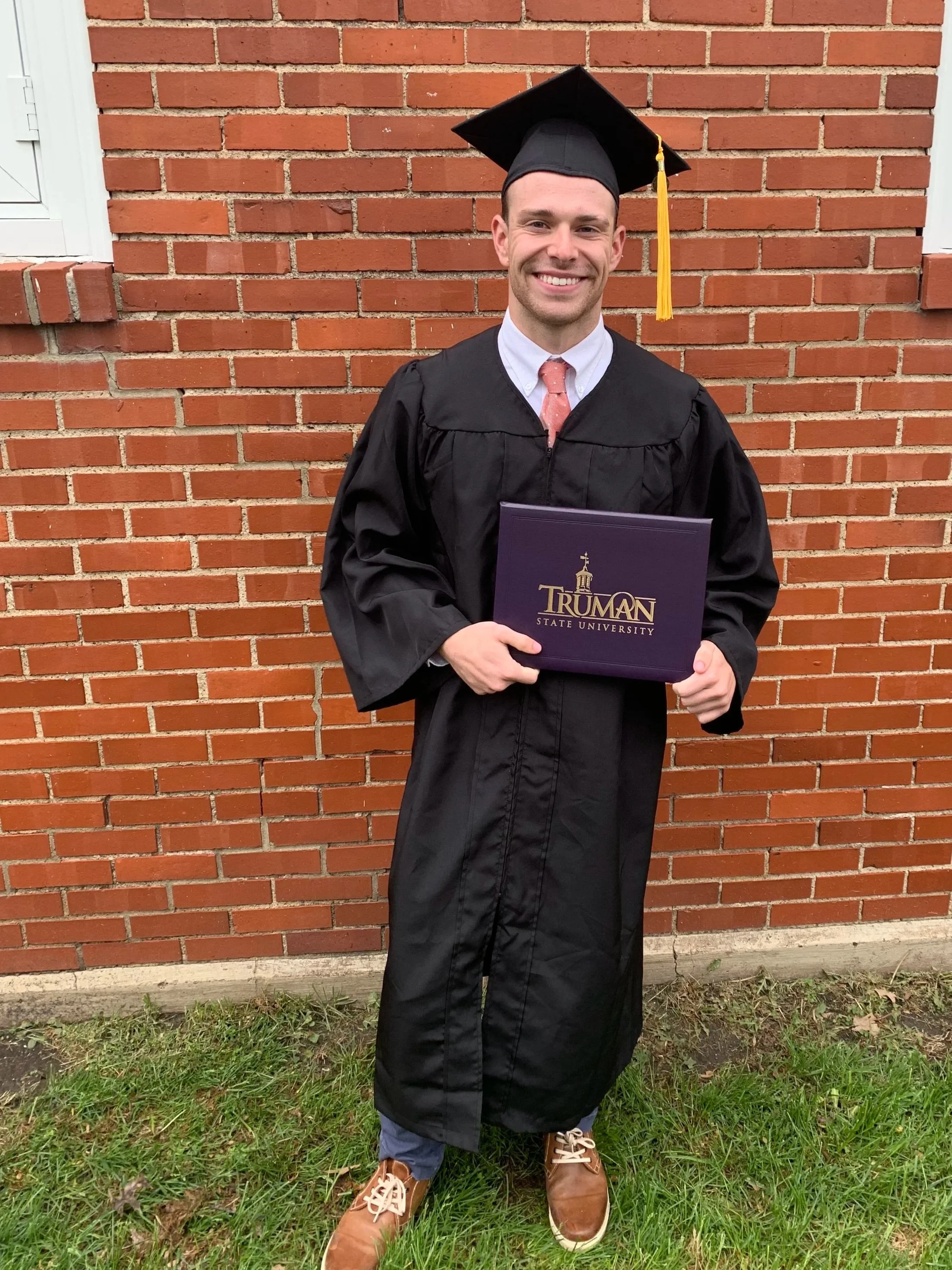
EARNING MY DEGREE
My time at Truman State University helped shape the way I approach creativity, business, and problem-solving.
Studying marketing gave me a foundation in consumer behavior, branding, market research, and commercial strategy. One of my most influential experiences was my marketing capstone course, where I explored advertising strategies and how brands enter new markets. It challenged me to think beyond individual products and consider the larger relationship between a brand and its audience.
Although marketing was my primary focus, some of my favorite courses were in graphic design. I enjoyed working within creative briefs, experimenting with visual storytelling, and bringing original concepts to life.
One professor particularly influenced my approach to design by emphasizing authenticity and resourcefulness. If a project called for a specific photograph, we were encouraged to create it ourselves rather than rely on shortcuts. That hands-on mindset has stayed with me throughout my professional career.
Together, these disciplines taught me to balance creative expression with strategic thinking—a combination that continues to influence my work in product innovation and commercial development.

ATHLETICS & TEAMWORK
One of the biggest reasons I chose Truman State University was the opportunity to compete on the men's swimming team. Recruited by Coach Ed Petre as a sprint specialist in the 100-yard butterfly and 100-yard backstroke, I went on to improve my times across nearly every event and contribute to breaking two school relay records.
But my greatest takeaway wasn't a personal best or a record. It was the people. Training twice a day, six days a week, created bonds that extended far beyond the pool. My teammates became family, teaching me the value of consistency, resilience, positivity, and giving my best even when the work was difficult. Those lessons continue to shape how I approach challenges, collaboration, and personal growth.

SWIMMING FOR A CAUSE
One of the most meaningful experiences during my time at Truman was participating in Swim Across America, a nonprofit organization that supports cancer research through charitable swimming events.
The mission was especially personal to me. My mother was diagnosed with breast cancer in 2010 and again in 2020, making the opportunity to support cancer research particularly meaningful. Through three Swim Across America events, I raised more than $2,500 toward the cause.
Swimming had always been a major part of my life, but this experience gave it a greater purpose. It showed me how a shared passion, combined with a supportive community, can make a meaningful difference beyond individual achievements.
GRAPHIC DESIGN WORK
My graphic design coursework gave me the opportunity to explore branding, advertising, typography, and visual storytelling through a variety of creative projects. Each assignment challenged me to translate an idea into a visual experience while considering the intended audience, message, and overall design.
These projects helped establish the creative foundation I continue to draw on today in product development, merchandising, and brand strategy.
BRANDING: LEGO CREATE-ALONG
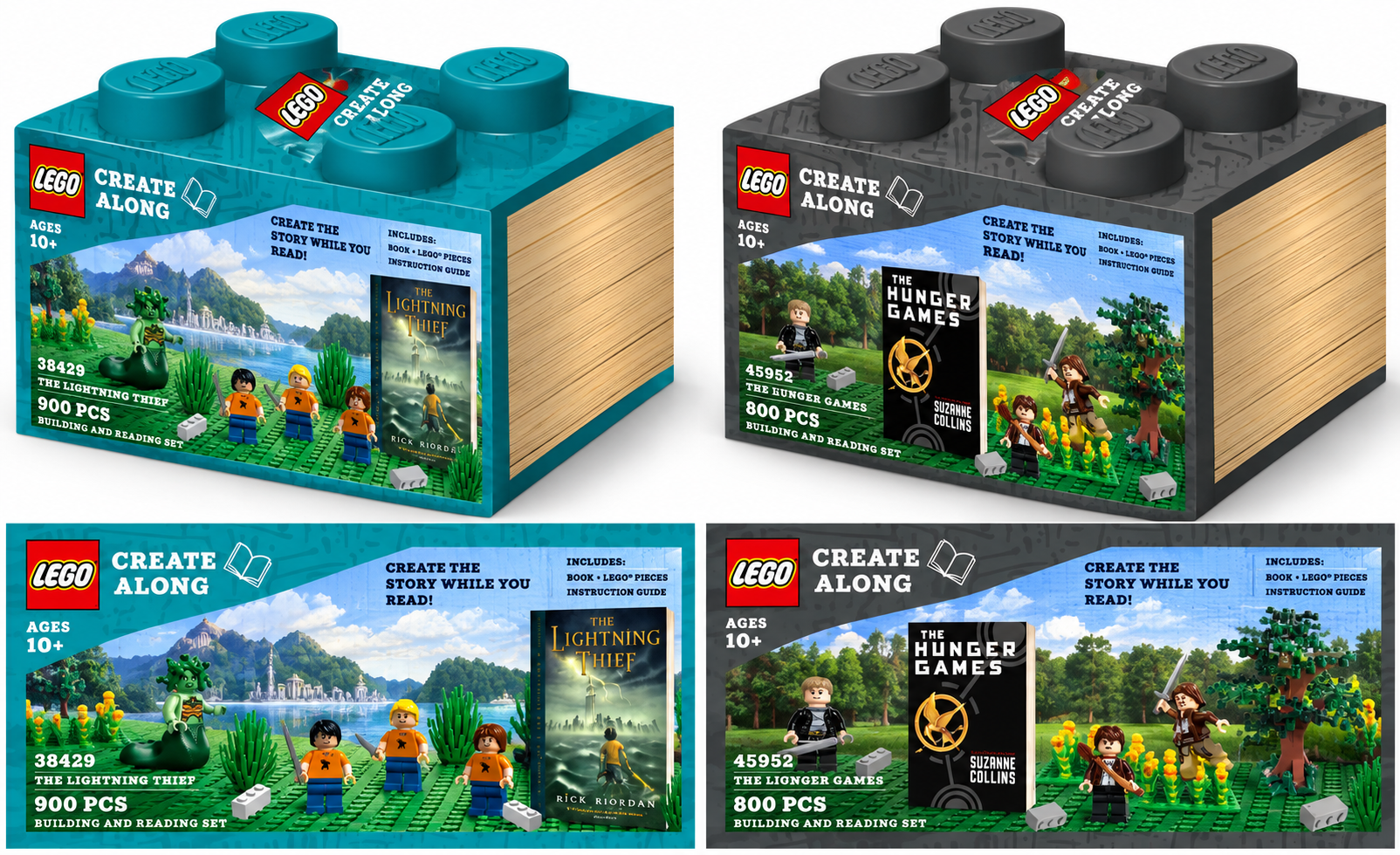
Developed for a college marketing course, LEGO Create-Along was a product concept designed to make reading a more interactive and immersive experience.
The idea combined popular book series with hands-on LEGO building activities. Each set would include a novel, building instructions, and themed LEGO pieces, allowing readers to recreate key elements of the story as they progressed through the book. By the final chapter, readers would have both a completed story and a collectible creation inspired by it.
I developed sample concepts for The Hunger Games and Percy Jackson & the Olympians, exploring how storytelling, licensed properties, and creative play could come together in a new product experience.
BOOK COVER REDESIGN: DOROTHY MUST DIE SERIES
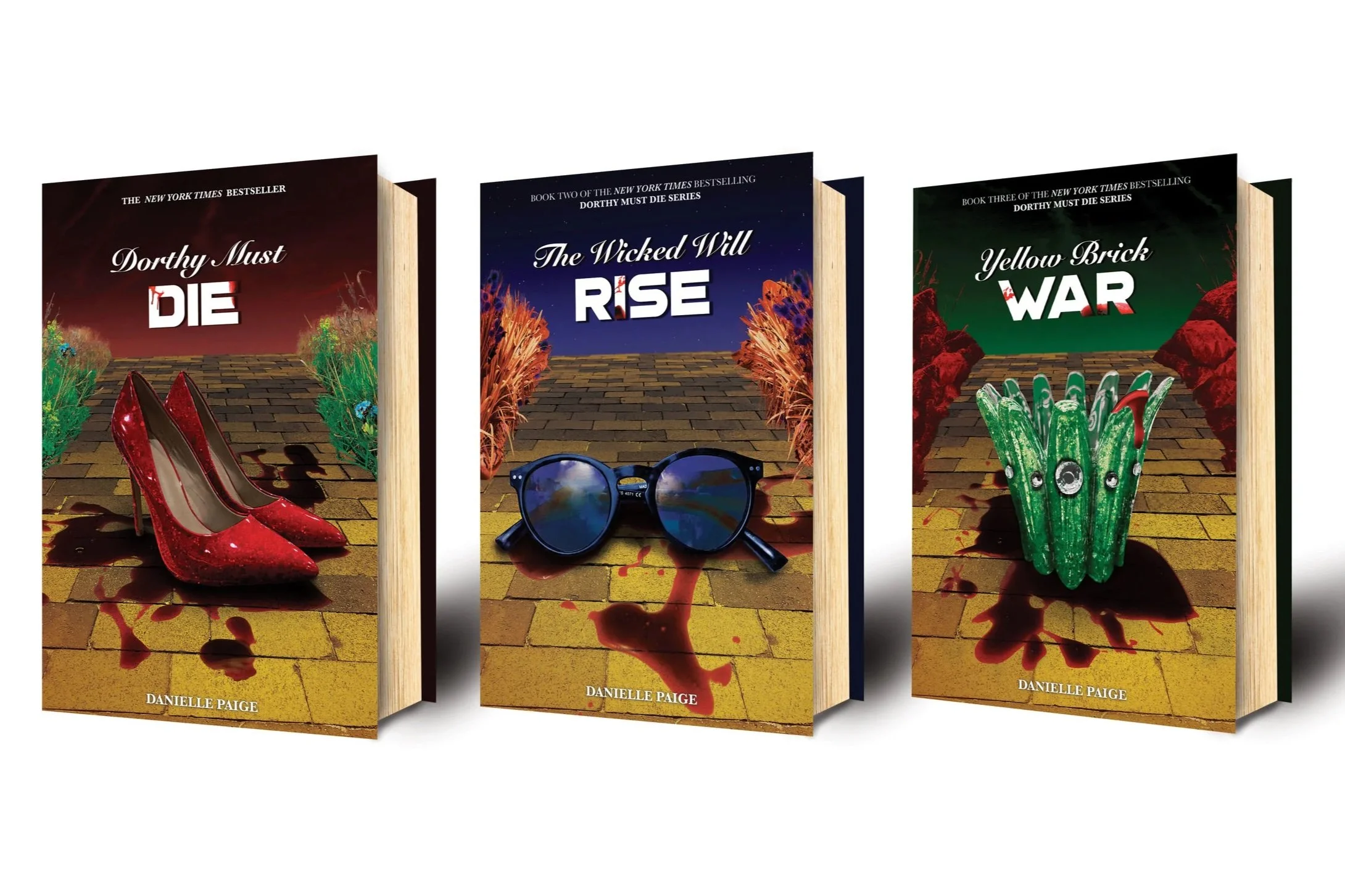

ORIGINAL COVERS
For this graphic design project, I was challenged to reimagine the covers of books I had previously read, creating new visual interpretations while preserving the essence of each story.
My approach focused on stronger imagery, original photography, darker visual themes, and more intentional typography. I wanted each redesign to capture the mood and personality of its story while creating a more dramatic and engaging first impression.
WHITE CLAW HARD SELTZER ADVERTISING CAMPAIGN
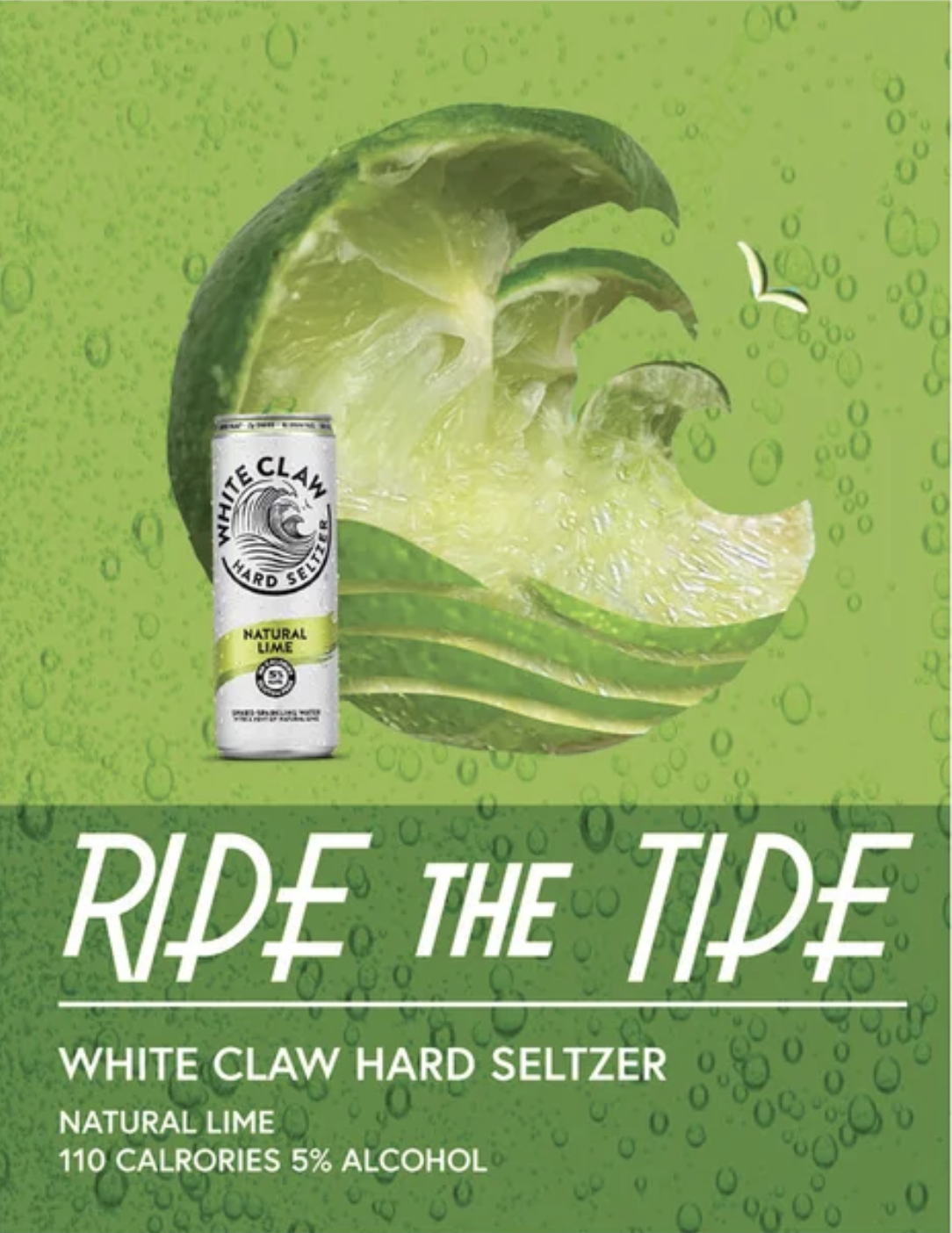
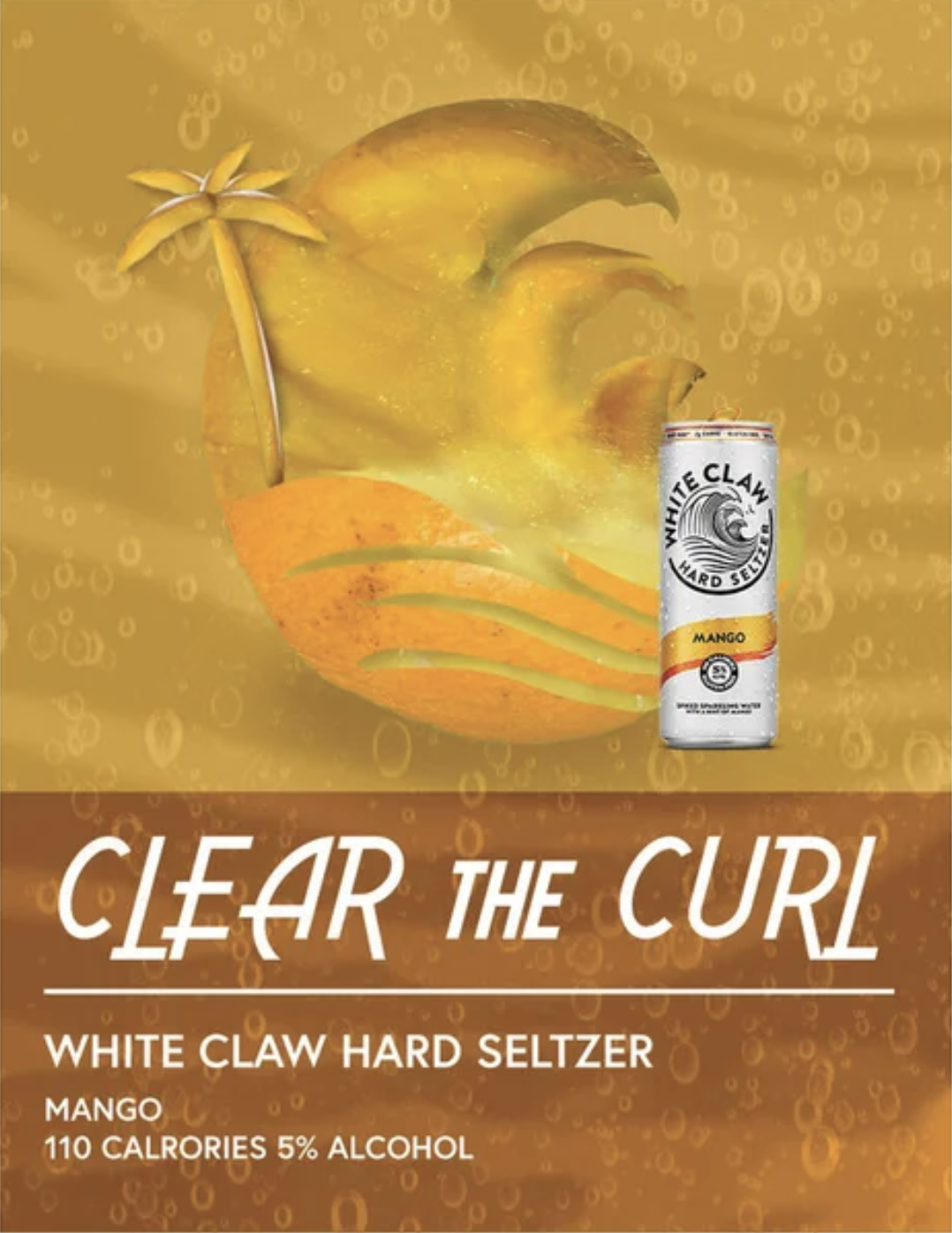
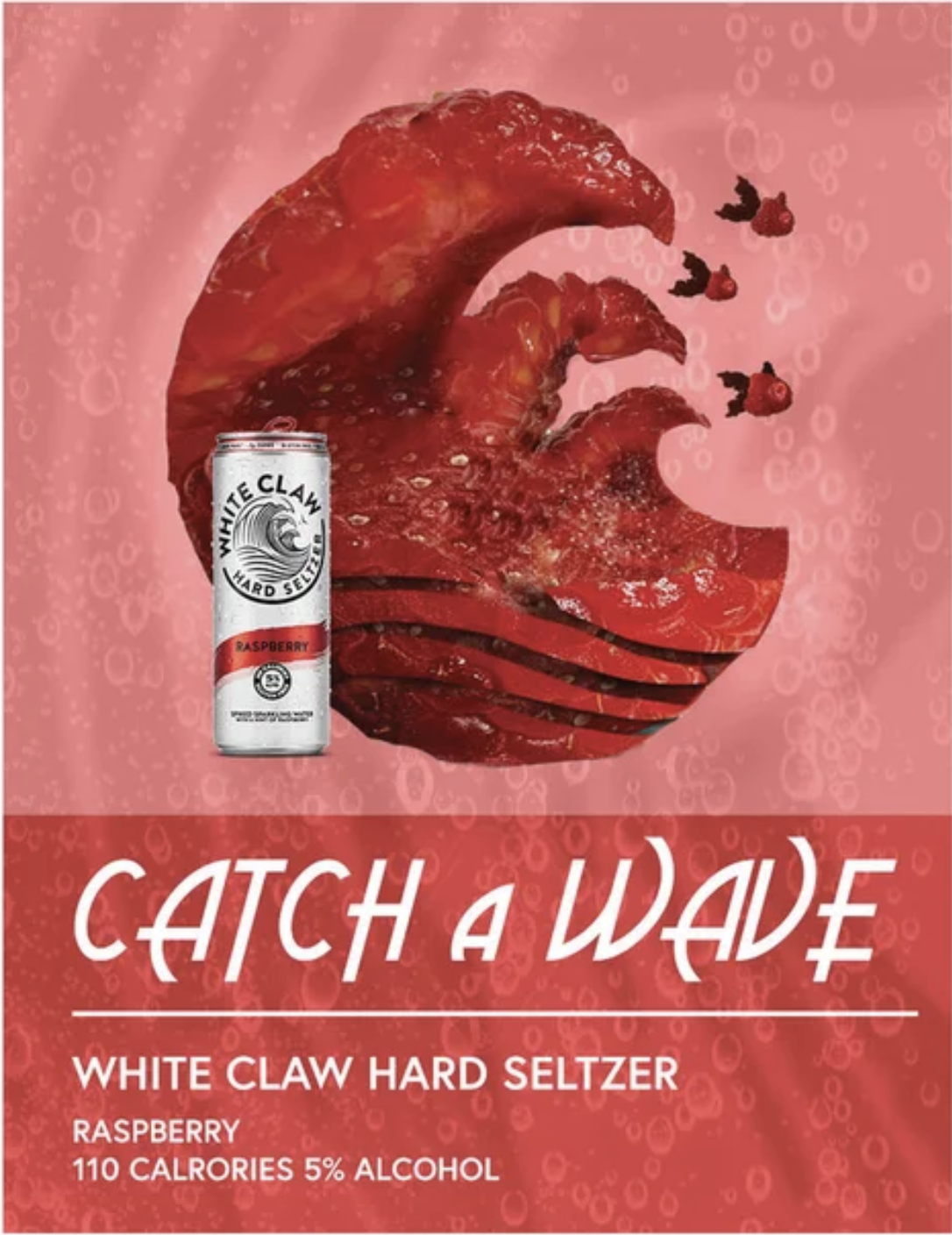
For this graphic design project, I developed a series of advertisements inspired by White Claw Hard Seltzer, exploring how product photography, image manipulation, and composition can create a cohesive advertising campaign.
My approach focused on using fruit imagery as a bold visual focal point, incorporating product photography, and maintaining consistency in color, typography, and overall design across the series.
The goal was to create visually engaging advertisements that felt connected as a campaign while allowing each design to have its own distinct personality.››
MEN’S SWIMMING FUNDRAISING CALENDAR


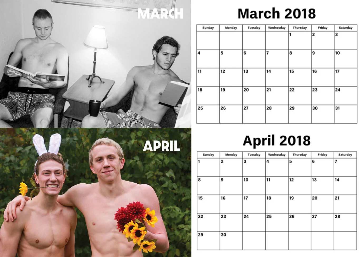


During the 2017–2018 swimming season, a teammate and I developed a fundraising calendar for the Truman State University men's swim team. What began as a friendly fundraising competition with Lambda Chi Alpha fraternity became an opportunity to combine creativity, teamwork, and marketing.
I took the lead on the calendar's creative execution, coordinating photoshoot concepts, selecting locations, organizing teammates for each photograph, and managing the photography and photo editing. I also helped market and sell the finished calendars to sororities and women's athletic teams across campus.
The project raised more than $1,000 for the swim program and gave me hands-on experience taking a creative concept from initial planning through production, promotion, and sales.
CD PACKAGING REDESIGN - PASSION PIT: MANNERS
For a visual communications course, I was challenged to reinterpret the album artwork for one of my favorite CDs, Manners by Passion Pit.
Inspired by the original cover's abstract, flowing shapes, I experimented with physical paint to recreate a similar sense of movement and energy. My goal was to translate the artwork's fluid, colorful aesthetic into something tangible, using hands-on techniques rather than relying entirely on digital effects.
THE LIFE OF AN EGG - A POSTAL STAMP SERIES
For this graphic design project, I was challenged to create a series of five postage stamps centered around a breakfast theme. The assignment came with two creative constraints: use only two colors and establish a continuous visual flow from one stamp to the next.
I chose to tell the story of an egg's transformation into an omelet, using each stamp to illustrate a different stage of the process. My goal was to create a cohesive series that could stand on its own as individual designs while forming a complete visual narrative when viewed together.
The project challenged me to think creatively within limitations, using composition, color, and sequential storytelling to connect five individual illustrations into one unified design.
CLUB CULTURE - A DRUG AWARENESS CAMPAIGN
For this graphic design project, I created a series of two awareness posters addressing substance abuse within nightlife and club culture.
My creative approach centered on using surreal, unexpected imagery to capture attention and encourage viewers to take a second look. Rather than relying on traditional public service announcement designs, I wanted to create something visually unsettling and thought-provoking.
The goal was to use bold visual storytelling to spark curiosity, challenge perceptions, and encourage greater awareness of the risks associated with drug use.
EXPLORE YOUR SPACE - ACADEMIC MAJOR POSTERS


For a graphic design course, I developed a series of promotional flyers introducing prospective students to different academic majors at Truman State University.
Inspired by the tagline “Explore Your Space,” I created a colorful, space-themed visual identity that carried across the series. Each flyer used vibrant colors, floating illustrations, and playful compositions to represent a different field of study while maintaining a consistent design style.
My goal was to make academic information feel more engaging and approachable, using visual storytelling to spark curiosity and encourage incoming students to explore their interests.
ILLUSTRATIVE WORK - DROP CAP & FONT STICKERS
For a typography course, I created a series of decorative drop caps, each inspired by a different theme assigned by my professor.
The challenge was to transform individual letters into expressive illustrations while maintaining their readability and recognizable forms. I experimented with color, composition, and decorative details to give each letter its own distinct personality.
This project allowed me to explore the intersection of typography and illustration, turning simple letterforms into unique pieces of visual art.
ORIGINAL LOGO PROGRESSION
This was one of the first logos I created for myself in college. I am a creative individual and have an eye for design. I have dark teal eyes as well. That was the main focus in most of the designs along side merging the “C” with the eyeball.

LET'S CREATE SOMETHING GREAT.
I'm always interested in connecting with people who share a passion for product innovation, consumer trends, and creative problem-solving.
Whether it's exploring new opportunities, exchanging ideas, or collaborating on something exciting, I'd love to connect.

CALEB KRUSE © 2026